Quantcast
Channel: Left Me Wanting More
Viewing all 81 articles
Browse latest View live

The Heat Of The Light On My Face

$
0
0


My Name Is Martin Shears - Andrew White

My Name Is Martin Shears.There is an implied period at the end of that statement. Maybe even an exclamation point. But as the narrative moves forward the resolve it once had begins to falter. That implied exclamation point becomes an implied period, and that implied period becomes, at last, an implied question mark.

(My Name Is Martin Shears…?)

Martin Shears identity is always in doubt. His thoughts and image are in flux. From the very outset the cover, which bears Martin Shears portrait, is not a even constant. As every copy has a different image adorning it, each hand drawn by White in varying colors and styles. Making it so that every buyer is given there own, unique, image to identify with as Martin Shears. But one which is never be repeated. Never replicated.

From his presence on the cover forward Shears identity is never cemented for the reader. He has no defining traits, his hair, nose, and clothes all conspire panel by panel to make it impossible to nail him down. His thoughts are purposefully muddled and obscured by Whites choice to place them within his messy linework, overlaying them on top of Shears head and making them almost unreadable as they blend together into one single mass. White forces you to strain yourself to read Shears thoughts, and even then your efforts are largely unrewarded, as there is little information to glean from them.

White takes this purposeful confusion even further than merely knowing what Martin Shears is supposed to look like and think though. Shears own narrative isn't even allowed to stay consistent for each reader; as there exists four different versions of My Name Is Martin Shears each with added and subtracted pages and scenes that are placed in differing order, so that not even the pages sequencing rings true. Mixing the non-linear narrative into four distinct versions creates a near infinite number of iterations in practice though, creating, like each cover, a singular Martin Shear for each reader.  One that is unlikely to be read by anyone they know. Like Chris Ware’s Building Stories the narrative you are given is the one that you pick out of the stack. This randomness simply becomes another form of subterfuge in trying to identify the man named Martin Shear. There is no “true” Martin Shear though, but simply the one you are holding in your hand

This all culminates in the stories final page, not the final page of the comic, but the back cover which all but cements this fog. Depicting a piece of white paper sitting on top of a desk with the words Martin Shear scrawled across it. The name is repeated sixteen times, but following the third line the name begins to mutate, letters morph or are dropped at random and the name being written becomes as cloudy as the narrative, until it turns into a something with no bearing to the one which adorned the top of the page.

My Name Is Martin Shears is narrative game of Telephone, with every reader receiving their own answer.


**************

Andrew Whites Tumbler can be found here.

There's A Kid On The Street, One Up In Bed

$
0
0
(a reprint of an interview on a book you should buy.)


"This week, I am going to catch up with fellow C Box contributer, co-host of the greatest comic book podcast The Splash Page, and all around great human being Chad Nevett. Chad edited and contributed essays to the long awaited new Sequart book release 'Shot In The Dark: A Savage Journey to the Heart of Transmetropolitian' which is available to purchase from Amazon and other  fine book retailers right now. Here's a little info on that release...." - Joey Alusio

Shawn Starr: How did you come to edit a book about 'Transmetropolitan' for Sequart?

Chad Nevett: Blame that, like my other big writing gig (for CBR), on Tim Callahan. He wrote his Grant Morrison book for Sequart and they wanted him to do something for their website. He decided to do a discussion column and asked me to do it with him. That was January or February of 2008... the beginning of the Splash Page. We did that for Sequart's site and, in the process, I got added to their e-mail list when new projects would come up and they would open the call for essay pitches. I wound up doing three essays over a few years, one for their 'Watchmen' book and two for their 'Planetary' book. Shortly after the 'Planetary' book came out, I began talking with Mike Phillips about doing something for them, hopefully a book entirely by me. They had asked for three book ideas and I had two: one about Jim Starlin's cosmic work and an anthology about 'Hellblazer'. I figured that I'd give them one idea that's all me and one essay collection to increase my odds of actually getting something done. But, I needed a third idea. Really, those were the two projects that I was excited for at the time, so I threw in something about 'Transmetropolitan'. I'm a big Ellis fan and I had some ideas about the book and... well, I needed a third idea and I didn't think Joe Casey would sell, you know?

Turns out, "Warren Ellis" was the name to mention at Sequart at the time as they were looking to launch a bunch of projects surrounding Ellis. They already had the 'Planetary' book and the documentary about Ellis that Patrick Meaney had done would be coming out, and a couple of more books gave them their "Year of Ellis" project. They're a fan of the anthology books -- and I can see why given the variety of topics and writers you can utilize in anthologies -- and, since they already had a single-author Ellis book scheduled, I think they wanted another anthology to complement the 'Planetary' one. So, they asked if I'd be interested in editing it. I figured what the hell, should be fun...


Do you have a personal connection to 'Transmetropolitan'? It seems like a work that, if read at the right time in ones life, can have a lasting effect on you.

You can say that it came along at the right time in my life to make a lasting impression. I want to say that I began reading it in January 2000, so I was around 16/17 (my birthday is in January), I was politically minded, feeling trapped in a bit at Catholic school, feeling like I was smarter than everyone around me, and hungry for stuff like Transmet that would both validate and challenge what I was thinking and feeling. I had been an Ellis fan for years, first having my 12-year old mind blown when he took over Thor and, when I first tried out Transmet, was pissed off because he had just left 'The Authority', which was a comic that I was obsessed with in a big way when it was coming out. I literally carried the first four issues around in my backpack for months, randomly pulling them out and just re-reading and flipping through them. And Transmet went beyond that stuff.

I started out with "Year of the Bastard." My shop had all six issues in the back issue bin, so I plunked down my cash and was introduced to the world of Spider Jerusalem. I don't know if I had started reading the comic from the beginning if I would have been so taken with it. But, beginning with the big politics story arc was the perfect thing to hook me. And, in the process, Warren Ellis introduced me to Hunter Thompson. It's not coincidental that that's where I began the series and the essay that I wrote for 'Shot in the Face' is a look at the influence of Thompson upon 'Transmetropolitan'.

After I discovered Transmet, I'm sure the people around me found me a little more annoying. I covered my binder with quotes from the book and talked shit and talked politics like I knew what I was talking about... it was a good time. Transmet was the second half of high school for me along with Thompson and Mark Leyner (who I learned about from a Transmet letter page!) and all sorts of obnoxious self-righteousness that's yet to wear off entirely...


What was your editorial approach to the book. Do you see it as an academic piece of criticism or something more free flowing?

Well, Sequart's aim is more academic than anything and I have spent six years in the world of academia, so I think there's an academic approach/feeling that's hard to escape. However, that's not something that necessarily drives me in a project like this. I tend to be a bit more free flowing as a writer. Once you've got that smart, academic base, you should feel free to push things and chaff against it a bit. I was hoping for a book that contained a nice variety of voices rather than a more unified feel that you might find in an academic journal (though, there can be some nice variety there as well, don't get me wrong). If I had to choose between voice and adhering to an academic approach, I usually sided with voice. But, that's because I also knew that I had guys like Mike Phillips and Julian Darius backstopping me. I could afford to push things a little bit that way, because they (and the rest of their editorial team) would stop things from going too far outside of what they think fits with Sequart.


Did your opinion of 'Transmetropolitan' change during the process of working on the book? Was there any contributors whose essay’s changed how you thought about the work?

I have a pretty strong opinion/view when it comes to Transmet, so I wouldn't go so far as to say anything changed during the process of working on the book. I think it's more accurate to say that I was exposed to ideas that I hadn't previously considered. I didn't agree with all of them, but that's hardly the point. Julian's essay on the structure of the book made me rethink the way that the series was put together. Namely, I knew it could be broken down into six-issue chunks because that's how the trades were put together, but I never looked beyond that. I never noticed how Ellis used three-issue groupings throughout the run... except for year two. I never thought about how "Year of the Bastard" and "New Scum" are the only six-issue story arcs in the series. It was an angle that I had never considered that I really liked thinking about for a bit there.

Almost every essay had at least one moment like that where I saw some aspect of the book in a way that I hadn't before. I don't agree with the majority of Greg Burgas's essay (let the internet feud begin!), but he makes a good case and he made me consider the way that I viewed Spider's relationship with women. It influenced part of my essay comparing Hunter Thompson and Spider, and each of their relationships, not just with women but with men, too. That was a big appeal of the project and something that I hope readers take from the book. I know it's something that I've loved about the Sequart anthologies I've read.


The book seemed to be delayed for a while, was there a specific reason behind that?

There were two main reasons. The second one is an easy explanation: it took time to transcribe Warren Ellis' interviews for the documentary and we wanted to include what he said about 'Transmetropolitan' in this book. I love when books like these have some author interview and Sequart has a wealth of Ellis interview material in the footage that Patrick Meaney shot with him, and it's a great idea to cull the appropriate parts for books like these. Transcribing those interviews took time, so the book wound up getting delayed until those transcriptions were done.

The first reason for delay is a little tougher to explain. Basically, I learned that I like writing, but I don't like editing. It's not something that I find natural or comfortable. I can revise and rework things I've written, but handling things written by others is tough for me. I think my limit of comfort is reading an essay and making some notes on it. But, this project required more than that and it took me a long time to be able to do that. Far longer than it should have. Thankfully, Mike and Julian were both very understanding and very encouraging. I'm glad that I did this, but I definitely learned that editing is not something that I enjoy.

It's a little weird to say that, because I did love working on this book. It was a pleasure working with Mike and Julian from discussing possible topics to reading essay pitches to reading the essays to working with Kevin Colden on cover ideas... It was a blast and I am really proud of the book. I just don't want to edit another book again. Ha.

Any cool stories involving a chick?

This one time, I got my wife pregnant...

(This interview originally appeared on The Chemical Box)

{Scattershot 6}

$
0
0

Webcomics


where my big takeaways from the Comics Workbook competition this year. I am glad both artists won. You can view all the other winners, along with the special mentions, here.

Chris Ware is up to page six (seven if you count the prologue) on his weekly webcomic The Last Saturday. It feels very Rust Brown to me right now, which i take to mean it feels like a Chris Ware comic.


Julia Gfrorer teams up with Sean T. Collins again, this time in an exploration of what lies under the sea. You can read Why We Fear The Ocean here.


Emily Carroll has a new webcomic up. Based on her previous work I assume it is scary.


Interviews


Chris Mautner conducted a career spanning interview with Michel Fiffe. I really enjoy reading Fiffe talk about old comics.

Katie Skelly posted a transcript of the panel she moderated at SPX Sex, Humor and the Grotesque which included Eleanor Davis, Julia Gfrorer and Meghan Turbitt. (The second half of that talk, where Skelly moved away from individual artists talking about their work and into a general discussion was particularly interesting.)

I liked this section from Gfrorer:

Well, first, of the staining thing, a lot of my work is preoccupied with residue, evidence of non-physical experiences and how it kind of erupts through to become manifest. I suppose the one-sidedness of it… there’s definitely always an examination of different types of power dynamics. Partly I think because I’m not writing about it for fun. I’m not writing about sex for it to be fun, like, “Hey guys, did you know sex is really fun? Surprise!” That’s not productive, to me. I want to find the thing that is challenging. And something like this, where it’s erotic, it could be read as porn, but to use this awful word, “problematic” … it’s problematic. And I don’t want there to be a comfortable place where you’re pretty sure you’re supposed to know how you feel about it, because I hate that.”


Blaise Larmee was interviewed by Nicole Reber. From interviews and talks i’ve seen done with Larmee he has a very calculated mischievous side, which you can see sparks of here, but luckily it is reigned in enough to still be fully readable. (Larmee has a tendincey to deliberately tank interviews, which while enjoyable on some level aren't always the funnest thing to read.)

Anne Ishii interviews Jillian Tamaki on various things including her newest book This One Summer.

“AI:  What’s the color psychology there? You just said that the purple harkens back to vintage manga.

JT: Not in any symbolic way. I mean, Rose reads manga and she is a manga fan because she’s like… 12. But I just thought it made the book feel a little warmer. Plus it looked different and unusual. Just on a formal level, it adds something undefinable—something nostalgic and a little bit warm.”

Vice interviews Breakdown Press, which seems to be stepping into the void left by Picturebox. At least with there continuation of Ryan Holmberg’s vintage manga line. (The only reason i’ve yet to read their output is shipping costs, hopefully CAB resolves this problem.)


Cynthia Rose profiles Nine Antico, who i have never heard of before this but based on the artwork shown I should immediately become acquainted with.

John Porcellino interviewed by TJC.

Essays


Jeet Heer reviews a new book on the origins of Wonder Woman. Those early Marston comics (or as the book make clear Marston/Holloway/Byrne comics) always seemed like the most interesting things to come out of the golden age of comics. At least when it comes to gender and sexuality.

Misc.


Every Chris Ware New Yorker cover. Most of what i’ve read concerning Moley’s editorial process surrounding New Yorker covers, and why i assume so many comic artists seem to draw them, is that each cover has to tell a complete story on its own. What is interesting with Ware’s covers are that while each of them tell their own story, when they are groped like this they begin to tell a greater narrative between them. Shifting in and out of generational perspectives and the role technology place within each. A few of these comprised Acme Novelty 18.5 so i assume Ware thought so to.

CAB is Pre-Selling tickets for their sunday panel schedules. Tickets are free so i assume this has more to do with making everything orderly, along with them not having a big enough venue for some of the talks.

Issue Six of Comics Workbook Magazine was announced as debuting at CAB. I’m glad that i’ve yet to see one of those issues where i’ve heard of more than half of the titles or artists being discussed.


Bleeding Cool ran a piece on how Zero #11 was rejected from Apples comics service presumably because of the opening sex scene. Which is stupid. What is also stupid is that Bleeding Cool picked the one panel in that opening sequence without any genetalia in it (the image they chose had a reaction shot covering Zero’s dicks while it was going into Siobhan’s mouth, which seemed oddly joke-y to me in the comic let alone in a article about its cencorship). Comics Alliance does this also, even post-AOL, where they discuss Apples prudishness towards sex while also displaying their own sites prudishness towards sex. Bleeding Cool being run by Avatar Comics makes the whole thing even more confusing. I’m not sure where this is going, i think i’d just like to see more dicks in comics.

In more dicks in comics related news though Fantagraphics put up a 16-page preview of Massive there anthology of “gay erotic manga”. Like its spiritual predecessor The Passion of Gengoroh Tagame there seems to be a heavy amount of scholarly and biographical information being included about each contributor, which was one of the strongest parts of the Tagame book. 

Media Consumed In The Month Of October

$
0
0


Comics
Beauty - Kerascoet & Hubert
Slow Graffiti - Noah Van Sciver
Blonde Copra - Jonny Negron
The Mysterious Underground Men - Osamu Tezuka
My Name Is Martin Shears - Andrew White
The Adventures of Venus - Gilbert Hernandez
Spacehawk - Basil Wolverton
Schizo #4 - Ivan Brunetti
Misery Loves Comedy - Ivan Brunetti
Dominic Fortune: MAX - Howard Chaykin
Caliban - Garth Ennis / Facundo Percio
Escapo - Paul Pope
Weapons of Mass Diplomacy - Abel Lanzac / Christophe Blain
Tokyo Zombie - Yusaku Hanakuma
Dogs and Water - Anders Nilsen
Blacksad: Amarillo
Girl - Peter Milligan / Duncan Fegredo


Movies
Scream 2
Boardwalk Empire Seasons: 3,4,& 5
Harmontown
Crash
The House of the Devil
Vivre Sa Vie
Brooklyn
New Girl Season: 3
Listen Up Phillip
Gore Vidal: The United States of Amnesia
Halloween: Resurrection
Scary Movie 2
Hellraiser: Hellworld
The Purge: Anarchy
What If
Snowpiercer


Books
Wolf in White Van 

CAB, CAB, CAB.

$
0
0
This is a complete list of exhibitors attending CAB. At least to my knowledge. Underneath some exhibitors I highlighted new books of theirs that i think would be worth at least skimming through if you come across them at the show

I'll likely be adding onto this list over the course of the week as i come across new stuff. Recommendations are welcome, since i have a tendency to miss out on at least two or three major books each show out of sheer ignorance.


(list stolen, but reformatted, from the CAB site)

AdHouse Books                                           
Lala Albert       
Alternative Comics                                                   
Heather Benjamin                                                   
Nick Bertozzi                                                   
Booklyn Artists Alliance                                                   

Breakdown Press                                               
Flowering Harbour - Seiichi Hayashi (edited by Ryan Holmberg)
The Man Next Door - Masahiko Matsumoto (edited by Ryan Holmberg)
Sindicalismo 89 - Ines Estrada
Janus - Lala Alberts
   
C. M. Butzer       
Scott C   
Sabin Calvert                                                   
Coin-Op                                                   
Allison Cole                                                   
Collective Stench                                                   
Colour Code                                                   
Comic Book Legal Defense Fund                                                   

Comics Workbook                                           
Comic Workbook Magazine #1-#6 - Edited by Andrew White       

Cosmic Beholder                                                   
Matt Crabe                                                   
Czap Books                                                   
Decadence Comics                                           
       
A.Degen
Junior Detective Files - A.Degen

Desert Island                                               
Square Dance at Palms Promenade - Various

DOMINO BOOKS          
Tusen Hjärtan Stark #1 & #2 - Edited by Austin English 

                                         
Dongery                                                   
Drawn & Quarterly                                                   
Enchanted Lion Books                                                   
Inés Estrada                                                   
EyeBall Comix                                                   
Fanfare/Ponent Mon                                           
Fantagraphics                               
                   
Michel Fiffe                                               
Copra #13 - #18 -  Michel Fiffe
Copra: Round One - Michel Fiffe

First Second                                                   
FUNCHICKEN           

Julia Gfrorer 
Palm Ash - Julia Gfrorer 
                               
Grindstone Comics                     
Lisa Hanawalt                                                   
HANG DAI Editions                                                   
Ian Harker                                               
Hic & Hoc Publications                                                   
Hidden Fortress Press                                                   
Paul Hoppe                                                   
Matt Huynh                                                   

Cathy G. Johnson         
Dear Amanda - Cathy G. Johnson

Aya Kakeda                                                   
Killer Acid                                                   
Jude Killory                                               
   
Aidan Koch        
Impressions - Aidan Koch

Koyama Press    
Lose #6 - Michael DeForge
Distance Movers - Patrick Kyle 
                                               
Kutikuti                                                   
Chris Kuzma                                                   
Patrick Kyle                                              
Ginette Lapalme                                           
Gary Leib                                                   
Linen Ovens                                                   
Locust Moon Press                                                   
Lost Art Books                                                   
John Malta                                                   

Blades & Lazers #2 - Benjamin Marra

Phil McAndrew                                                   
James McShane                                                   
Mega Press                                                   
Microcosm Publishing                                                   
Annie Mok                                                   
Kris Mukai                                                   
Negative Pleasure Publications                                                   

Jonny Negron
Song of Mercury - Jonny Negron

Neoglyphic Media                                                   
Mark Newgarden                                                   
Nobrow                                                   

Oily Comics                                                   
Daddy - Josh Simmons & James Romberger
Luv Suckers #1 & #2 - Chuck Forsman

Paper Rocket Minicomics                                                   
Partyka                                                   
Benjamin Passmore                                                   
Pegacorn Press                                                   
PEOW Studio                                                   

John Pham                                                   
Epoxy #6 - John Pham

Cody Pickrodt                                                   
Pigeon Press                                                   
Poety Unlimited                                                   
A. T. Pratt                                                   
Press Gang                                                   
Revival House Press                                                   
Rosebud Archives                                                   
Leon Michael Sadler                                                   
Yumi Sakugawa                                                   
David Sandlin                                                   
Scott Eder Gallery                                                   
Secret Acres                                                   
Matt Seneca                                                   
Koren Shadmi                                                   

Katie Skelly                                                   
Agent 8 - Katie Skelly

Snakebomb Comix                                                   
The Philosopher: A Might Star Info File - A.Degen

Space Face                                                   

Conor Stechschulte                                                   
Glancing - Conor Stechschulte

Leslie Stein                                                   
Karl Stevens                                                   
Wellington Sun                                                   
Panayiotis Terzis                                                   
Three-Armed Squid                                                   
Adrian Tomine                                                   
Jen Tong                                                   
Toon Books                                                   
Tom Toye                                                   

Meghan Turbitt                                                   
TEACH ME HOW TO BE A GOD - Meghan Turbitt

Uncivilized Books                                                   

Sara Varon                                                   
Zach Hazard Vaupen                                                   

Weird #4& #5 - Various
                                               
Lale Westvind                                                   
Leah Wishnia                                                   
Wizard Skull                                                   
Yeah Dude Comics                                                   
Yoe Books                                                   

Youth in Decline                                                   
Snackies - Nick Sumida
Frontier #6 - Emily Carroll

Z2 Comics                                                   

Medicine Comics - Mickey Z, Patrick Kyle, Michael DeForge

my dead eyed muse

$
0
0

------------------------------------------------------------
Nancy Is Happy: Complete Dailies 1943-1945
Ernie Bushmiller
------------------------------------------------------------

Daniel Clowes introduction to Nancy is Happy is quite possibly the oddest introduction i’ve ever come across. I try not to read introductions until after finishing the book, because far more often than not they act more as postscripts than introductions. Peter Bagge spoils his own work in Buddy Does Jersey for christs sake. The exception to this rule is comic strips, especially pre-1960 strips, where historical contextualization and author biographies tend to enrich the reading experience by a significant degree. Finding out that Roy Crane road the rails in college only helps you appreciate Captain Easy constantly ending up in the back of a train car in a last moment narrow escape. Due to most strips of the times gag a day nature, along with the repetition of adventure strips, any reference to future events in the strips at most causes minor “spoilers” of little to no significance.

Clowes’s introduction though does none of this. It doesn’t do 
much of anything really. It, in conjunction with the introduction that follows it by a “Fantagraphics Editor”, argues that Nancy is devoid of contextualization. That any knowledge of Nancy creator Ernie Bushmiller as a human being outside of the fact that he drew Nancy for the period of time being covered in this book, is unnecessary and may, in some ways, be detrimental to the reading experience.The only thing that either introduction does is state that Nancy is a comic which can be read in hundreds of different ways and in each one still be funny. It can be read as a hacked out syndicate strip made up of gags pilfered from old joke books, just as easily as it can be read as a subversive comedy on American morals. Both arguments have equally merit, dozens of others also, even Clowes speaks briefly about going through multiple periods in which he enjoyed the strip for diametrically different reason (most gravitate between genuine enjoyment and ironic distancing), but at no point did he ever stop enjoying Nancy.

When I first read this introduction I was struck by how lazy it seemed, why not get Jeet Heer or R.C. Harvey to write an actual intro and move Clowes’s “essay” to the backmatter, so that they could still slap his name on the solicitation, while also having an “actual” intro in the front. But then I started to read Nancy and was left looking at a strip that I just couldn’t wrap my head around. Nancy is funny, but it’s not funny in the same way as say Peanuts, which covers much of the same material (children and childhood). Peanuts has rules to it’s universe, it is clearly a story told by an adult about children; even if the parents never appear on panel.
Bushmiller though revels in the absurdism of childhood. Where Schultz (and later Bill Watterson) make allusions to great literature, famous symphonies, or have their child stand-ins wax poetically about the meaning of life, Bushmiller is more interested in creating farce.In Bushmiller’s most high minded and allusionary strips he places Nancy in the role of an attempted-Modernist painter. While other strip artists may want to speak of the various critical theories of the artistic movement, Bushmiller simply has Nancy view the art as a child would, looking at the pieces in the museum and in her mind believing she could create that. What follows are five days of silliness as Nancy attempts a series of get rich quick schemes across every art gallery in town.

Unlike most other old gag strips, where several basic set ups and concepts are repeated but spaced out sporadically, (like Charlie Browns neverending quest to kick the football) Bushmiller attacks each subject over the course of a weeks worth of strips. This seems to give a large amount of weight to the argument of Bushmiller gathered his gags out of a joke book, since the repetition of jokes reads more like a chapter out of a joke book than an exploration of an idea at first. But it is in this repetition,day after day, that Bushmiller is hammering home his concepts. Something that, if stretched out months in time, he could not have properly communicated. 


The most interesting, and often repeated, of these sets of strips deal with World War 2. Where strips of the time, like Roy Cranes Buz Sawyer, took great pains to show the homefront living in pre-war normalcy Nancy makes a point of showing the wars effects on the citizens living stateside. And while the premise of many of these gags seem trivial, Nancy and Aunt Fritz scrambling to find additional ration cards for stockings and shoes is an often repeated premise, the presence of that want underlies something that many strips of the era chose to overlook. It chips away at, however little, the veneer of normalcy perpetuated by the government at the time.


Nancy also takes great pains to explore the idea of wartime propaganda and its ability to instill fear in the populace. Like Joseph McCarthy saw communism on every corner during his red scare, Nancy sees Nazism everywhere. A cranky neighbor that refuses to buy war stamps is not simply an old crank, but rather, as only Nancy is able to discern, a Nazi. Nancy is able to surmise this not through anything as adult as evidence, but by the mans homes striking resemblance to the fuhrer. That many of these scenes take place immediately following Nancy and Sluggo reading posters put up by the war department is not a coincidence. The sincerity of childhood doesn’t allow Nancy to scoff at a poster declaring “Save Your Country’s Tires / Broken Glass Helps The Axis!” just as fear blinds many to the absurdity of propaganda; so that when Nancy sees a bottle shatter in the street after being thrown out of a window the pattern that the broken glass invariably leaves is that of a swastika.


These sets of strips although do have a problematic aspect. The final strip in each series has a tendency to involve Nancy & Sluggo actively advocating for the destruction of Japan. While the military aspects of the war in Europe are largely ignored, Bushmiller repeatedly makes allusions towards the destruction of Japan. These range from Sluggo blowing the island nation off of the globe with a firecracker to Nancy excitedly spraying poison gas on the Japanese Beetles that inhabit her garden.(Nancy has, in lieu of notches, etchings of the Japanesse flag on her poison sprayer for each insect killed). This particular ire towards Japan is not unique to Nancy, racial caricatures of the Japanese and a sense of vendetta runs throughout countless strips of the time, but it stands out so pointedly in Nancy because it comes out of seemingly nowhere. In a strip that is so critical of propaganda it turns a particularly uncritical and blemished eye towards Japan and Asia at large.  

This racial problem is also compounded by Foy Foy, Nancy's friend of Asian ancestry. With Foy Foy, as with Japan, you see Bushmiller's hand creeping into the world of Nancy. And this incursion is not for the better of the work, as Bushmiller infuses his own prejudices onto a world that seems unwanting of them. Of the five strips that Foy Foy appears in two have punchlines centered around slanted eyes, two more are given over to mocking his language and the fifth shows him exterminating Japanese Beatles with Nancy. 

Nancy is quite clearly Bushmiller, but while for the majority of the collection she feels like her own separate entity it is in these twenty or so strips that you are reminded that this little girl is the creation of a middle aged man.


Open Up Your Murder Eyes: Part 2

$
0
0


Part One can be read here.

(5) on sequencing in regard to section (1)

Most people would attribute the act of sequencing to panel borders. Borders control the way in which the readers eye moves across the page, both in the speed at which you process the information on the page and how your eye reads the page. Small and compact panels placed next to each other in quick succession force the eye to move faster while double page spreads, showing one single moment, force you to take in the whole event at once. Additionally the eye has a natural tendency to read images from the top left of the page to the bottom right, long vertical panels therefore force the eye to move up and down with little to no horizontal movement, while horizontal panels force them to move right to left with limited vertical motion.

Heather Benjamin does not use panels, although this does not stop her from controlling the readers eye. Dragging the eye left or right, up or down, not with borders but by the way she draws details, her backgrounds, how shocking she decides to make the image, what areas she chooses to leave empty and where she chose to implement language. All of these tools, played individually or in concert, allows her to move you across the image as she chooses.

(5.1) Sad Sex


The artwork in the first half of Sad Sex is rather simple, both in its line and backgrounds. There is not a lot for the eye to hold onto visually. This in many other cases would result in a rather fast read, as the eye recognizes the image and moves on quickly due to its simplicity, but the content of Sad Sex keeps this from happening. It is filled with alien imagery, things you are not used to seeing, literally sad sex. Viewing a sexual act where both parties are sobbing and clearly uncomfortable with the acts taking place is such a foreign concept in most of art that the long streams of tears flowing down each individual's faces holds your eyes in a way that the same image, devoid of these tears, would never.

The downfall of this though is that the rest of the image falls apart, the eye focuses on the points of carnage rather than the image as a whole. This is why in many of these early images there is no backgrounds at all, they wouldn’t be looked at even if they were present.

As Sad Sex goes on though Benjamin becomes a much more accomplished artists, and by the final third of the book her compositions are strong enough that she is capable of intentionally guiding the reader's eye to and from the more shocking content in each image.This is vital for the continued appreciation of her work, because as each image piles up the contents shock value begins to dissipate. As your eye focuses on the teary faces, they start to blend together, and by page forty they are just a part of everything else again.


The two page spread "You Make Me Feel Special" is a good example of Benjamin's leap in ability from the early pages of Sad Sex to the later.  

From the top right we see a series of hearts along with, momentarily, the woman on the lefts braided pony tail flowing alongside the words "You Make Me Feel" downwards and to the right, leading us to the next figure and the remaining part of the title "Special". This is in keeping with the natural flow of the eye. It is easy and happy. Non-complex.

But there are conflicts in this reading. This is only how you would read this image if you ignored the two women on either side of the page, and simply chose to focus on the cheery phrase "You Make Me Feel Special" and a trail of hearts. But these two women have their own agency, and so a contradiction is at play here. Like all good comics the text should not betray the picture by making its point to clear, and here it explicitly does not. The figures inside the composition are fighting against this flow. "You Make Me Feel" can be a good thing just as easily as it could be a bad thing. The same goes for "Special". These two women act out both of these dual scenarios, pulling and pushing away your eye, your gaze, to reflect their own feelings on their given phrases.

The woman on the left has her right arm fully extended, reaching out, begging for you to stay.
With her left hand, in a last ditch effort before your eye breaks the plane of the double page spread and moves onto the second page and the "other" figure, she is spreading her vaginal lips as wide as she can. Trying to catch your eye. This spreading is taking place just above the last few inches of braided hair which have balled up beneath her, creating a large black mass at the bottom of the page surrounded by flower petals. In her final gasp the figure even kicks her left leg over the page gutter and into the other figures space, almost touching the word "Special" but, almost poetically, she is a few centimeters short. Her foot and sock just can’t quite reach it.

This effort of course does not work. But not for lack of either figure trying.

As the woman on the left is actively trying to draw the readers eye towards her, a mirror image the woman on the right is actively attempting to push you away. She is covering up. But nature is working against her, both the nature of your eye and the nature of her surrounds.

If you look at the balance of data on each page, the densities of each figure and their backgrounds, you will notice the area surrounding the woman on the right is rather open compared to that of the woman on the left, whose entire upper torso area is surrounded by trails of hearts. The area surrounding the figure on the right though is much less dense, depicting only a small whirlpool (which surrounds her upper torso and head) and a mountain range. This largely empty space has the effect of drawing the readers eye along the horizontal axis towards it and  away from the more info dense area’s of the page. That this area is also inhabited by the figure who does not wish to be viewed is part of the tragedy of the piece.

(5.2) Exorcise


In Exorcise Benjamin made her intricate backgrounds a hallmark of her work, like a S.Clay Wilson image there is very little space left unstained by ink. Benjamin litters her backgrounds with data that the eye must compute instinctually for perceived meanings stars, UFO’s, constellations, various iconography and animals. These background images therefore have the role of creating the base speed for reading each image.  

With this base speed in place Benjamin is then allowed to shift the densities of the background data around her page to create her own form of panel borders. Leaving some areas blank while others almost black with ink, she is able to both draw and repulse the readers eye to any area she wishes.

In addition to densities there is also the use of language. Since so few words are used in Exorcise, when they do appear your eyes lock onto them immediately. That is why when you look at the earring saying “Shut Up” on the first page of the book yours eyes give it the same amount visual importance as the woman cutting her nipple off. Both are foreign, one from the book and the other from life. Or the above image, even as her hair takes over the entire image the heart tattoo with "Mom" inscribed within it becomes the images focal point.


(6.0) Image Symetry  
with apologies to frank santoro / i made this in ms paint so please pardon the hackishness of it.

In the image above we see a woman squatting. Her body is bleeding in symmetry with itself and its environment. The first thing your eye moves to is her right hand, which is making an "Okay" sign and bleeding in concert with her left hand that is dangling lazily downwards. Bellow, on the same vertical axle as her hands, you see that she is also bleeding from her knees. Upwards slightly and on a different vertical axis is her midsection, where both of her nipples are bleeding. Looking at the middle axis of the image we see the woman's face, which is characteristically bleeding, a third of the way down the page, and along the same vertical axis, we see the figures menstruating vagina.

While much of Benjamin's use of cosmological symbols are merely background details, her use of constellations in this image perfectly compliment the lines of symmetry for the figures bleeding. Two constellations are connected through an acute angle, which connect the hands, breasts and knees together. The five other constellations pictured are connected purely through straight lines, which creates the box with a line through it connecting the hands to the knees and face to the vagina as shown above.

The area's connected through these lines of symmetry share several characteristics that are repeated throughout the series, and while hands and knees have a certain non-reproductive sexual connotation, which are counteracted through the often repeated bleeding of the breast and its implications of motherhood, the most important is between the face and vagina.

These two area's become the focal points in the majority of the images found in this book, both independent of each other and, as in the image above, dependent on each other. Much of the "filler" imagery, the shoes, stockings, coats, backgrounds and especially the hair draws the eyes to these area's.

As i mentioned in section (3.1) hair above the shoulders plays an important part in drawing the readers eye towards the face. With its intricacies and detail the eyes lock onto it, follow it, and because of its proximity with the less detailed, but equally beautifully drawn, face the eye instinctually is held there as a resting spot. Similarly, and especially in the image above, the hair below the neck also draws the readers eye towards the vagina. As the eye recognizes each strand of hair on the figures legs, and above from the fur of the figures jacket, the white space of the inner thighs where hair is absent pulls the eye towards the  images second focal point, the vagina.


(7) Additional Info and tidbits

You can purchase various works from Heather Benjamin at her webstore. Additionally Benjamin has an eight page-broadsheet available from Floating World Comics titled Delinquent.

You can view her Tumblr here

Also if you enjoy interviews there is a very long and in depth one conducted bySean T Collins at The Comics Journal

(7.1) image attribution
The header image is from the cover of the Hidden Fortress's anthology Monster.
All other images are from either Sad Sex or Exorcise.


gimme a stiffy

$
0
0

Terror Assaulter: O.M.W.O.T.  - Ben Marra

  1. Color

Comic after comic Benjamin Marra’s inkwork has becomes more and more restrained. He has continually been refining his line so that the inking in Night Business #1 barely looks like something produced by his hand anymore. While Marra’s work has always had an intentional stiffness to it, his inking has been there to counteract the effect a bit. When he outlines a character’s arms, face, or body they resemble that of an action figure, but Marra’s wavy and pulsating inkwork within the figure, detailing their muscles and veins, creates enough internal motion in each figure to make you believe in their existence. In the external world of a Marra comic everything is on a razors edge, but internally, through his inks, he is able to create a living organism.

With the introduction of color to Marra’s work though the flowy nature of his inking is no longer enough to counteract his stiffness. They no longer provide dimension and depth to his figures, but rather produces, and amplify, the sheen of plastic within them.

Color in mainstream comics over the past decade has taken on the role of being a second form of inking, providing definition and delineating objects from one another. Marra though rebutes the over emphasis on gradients and light sources by only using single shades of primary colors to color his work. A throwback to comics made before the 1980’s, but also a throwback to toys. By only using these single shades Marra’s inks become the only contrasting colors within each figure, transforming their previous roles as textures into accents to these colors.

This is most explicit in Marra’s choice to color Terror Assaulter's suit a deep and dark shade of blue. This shade of blue so closely matches his black inks that when he shades a series of ruffles onto Terror Assaulter's suite, showing his post-battle dishoveldness, they do not convey the thought of a dirty suit to the reader, but rather the shadows produced by a child's hand as it reaches to grab a figurine and temporarily blocks the streams of light emitting from a lamp overhead.


  1. Dialogue

Marra’s dialogue, which was sparse already, has been cut down to a point where what little is left seems unnecessary. Each word spoken is as stiff as his linework. But while this is something that evokes the poor acting and writing of B-movies, which Marra is clearly infatuated with, it also draws to mind the only other comic artist out there who could be said to be more single mindedly focused on action as Marra, Yuichi Yokoyama. If you read a Yokoyama comic your first thought is that the translation is horrible. There is no humanity in his dialogue. But that is exactly what Yokoyama is attempting, he sucks the life out of every word until it exists as just pure description. His words are chosen so that they can thrive through the stripping process of google translate, not falter to it.

The dialogue in Terror Assaulter likewise has the feeling of a poor translation, but unlike Yokoyama Marra still has the emotional baggage of narrative to contend with. His words are forced to have the inclining of humanity in them, and while much of the dialogue in Terror Assaulter are simply descriptions, they are descriptions of actions and events rather than inanimate objects. The words spoken are boiled down to cliches, but they are about, and involve, humans. All this leaves Terror Assaulter with the feeling of a bad dub, but with enough life in each word to allow you not to walk away with a headache, but with a smile at the sheer lunacy of what you just witnessed.


You can purchase Terror Assaulter #1 at Colour Code.

untitled.

{Scattershot 7}

$
0
0
Webcomics


Artist GG has started to serializing a new strip at The Comics Workbook titled A Mysterious Process. The first 11 pages are already. I love that the dialogue looks like subtitles in old b&w french movies.


Configurations by Aidan Koch.


Winterbreak by Michael DeForge. DeForge does really great winter/x-mas themed comics.

Interviews


CF: I realize this might be an impossible question to ask, but why is it that the manga that you want to read has those aspects, no story or anything, like that war comic?

YY: It’s very difficult to describe, but in my personal life I don’t respect human feelings. I’m very far from human society, I’d rather appreciate natural phenomena. I’m very interested in understanding how a bird might see things. I want to delete the human feelings because the reader wants to emotionally take sides with one particular person and I’d prefer they remain neutral. That’s why I don’t want to produce a scene where people feel sympathy with a particular person.”


“MH: What is your drawing process like? Perhaps this is an echo of the question above, but some of your drawings feel traced- giving the sense that there if a referent just off the page. I think it’s the simplicity of some of your linework.

AK: I love drawing from life or from references. I think it’s interesting to appropriate or reconstruct material. I mean, you have to be careful and considerate about what and how you work with anything pre-existing, but I’m interested in the way anything can be re-contextualized. I feel like, again, the Internet has totally transformed this for us, and our ability to see the various ways you can visually connect anything to build new meanings and conversations. In some ways this relates to comics in terms of how you place material on a page or in a space, things automatically begin to inform each other depending on the panels and sequencing. Simply by placing images together in an order or over a series of pages, we naturally interpret this as narrative. Therefore, the craft is in how you select those images and where you place them to evoke whatever feelings you want to give your reader.”


Sontag: I don’t write because there’s an audience. I write because there is literature.”


Derf Backderf interviewed on Robot Six. In a few years i feel like the death of the alt-weeklies is going to be a bigger deal than is generally acknowledged right now. Especially with younger cartoonists, since webcomics, like blogs, don’t have the constraints of deadlines or the permanency of print.

Essays


Julia Gfrorer on Aidan Koch’s Configuration. The opening section comparing tarot cards to comics panels, and how one reads a narrative into them, is one of my favorite pieces of comics writing this year.


The last paragraph of the piece is particularly good:

“Excess isn’t always easy—it’s probably exhausting sometimes—but it requires a drive separate from talent or good ideas. Fukitor has excess in abundance and little else to distinguish it. This is a work that peddles exercises in genre secondhand. This is a work that, convinced it’s a rebel, behaves like a bully.”

Misc.


Michel Fiffe is running a subscription drive for issues #19 - #24 of COPRA . If you act fast you also get a free screenprint. COPRA is the best monthly alt-comic coming out, in addition to being the best super-hero monthly coming out. But the latter isn’t very hard.


Uno Moralez dropped the GIF of the year.

RIPExpo has posted the audio to each of the panels they conducted. I was in attendance for the Andrew White lead discussion on Poetry Comics which i can attest to be worth a listen.


I lost who drew this image, but it's from the Raymond Pettiobon / Josh Bayer talk at CAB. The passion with which old punks hate Regan is something I strive for.

Ines Estrada released her year end list of both comics and events which occured to her. You can read it here.


grazing by gazinnn

$
0
0


Crash Trash - Olive Booger


I think this is called a chap book. I am not sure. Pulling it out of the Oily bundle package reminded me of Building Stories. While the mini-comics that defined Oily still remained the bulk of the bundle, two lengthier entries by Noah Van Sciver and Charles Forsman were presented at larger dimensions and this short piece, existing at barely a quarter of a page in height, rounded out the package.

my immediate response to looking at this work is how closely it reminds me of two other somewhat recently released works. works which similarly existed in extremely limited number of pages but conveyed a deeply rich society within them. first is Gary Panter recently collected Dal Tokyo. Not that work as a whole, but just the first few pages or so. after the tenth page of Dal it progresses into something that i am left marveling at but not fully able (or capable) to grasp. like all of Panter’s work i digest it. am impressed with it. and promise myself ill understand it more next time. (theres always next time). Olive Booger borrows heavily from Panters more primitive and jagged line, while not as rigid and geometric, it no doubt evoke the idea of Panter. Everything is dirty and grimey and looks like the New York of Death Wish.

Crash Trash uses a faux-documentary style that has become one of the mainstays of michael defoge, who was the other person i thought of when looking at this. This style allows the narrative to move far faster and with greater depth than a more standard narrative device would allow. Instead of expository dialogue we only hit the highlights. no fat all filler. the Story itself is pretty funny. a group of gutter punks get beat up by another group after it is revealed they don’t really know how to fight,and instead just look tuff. After their defeat they move into trash bins to avoid being beaten up by the gang that has taken over their territory and create a society over the course of the ensuing 20 years; becoming hermit crabs of sorts.

you can buy Crash Trash at the Oily Comics site.

Media Consumed In The Month of November

$
0
0


Film & Television

It’s Always Sunny in Philadelphia Season 9
Life Partner
Le Mépris
Not Another Teen Movie
Two In The Wave
Edge Of Tomorrow
About Alex
Pierrot le fou
Z Channel
La Grande Illusion
Fury
This Is Where I Leave You
Short Term 12
You’re The Worst Season 1
Married Season 1 
The Simpsons Season 2-3


Comics

Thickness #1-#3 - Various (Edited by Ryan Sands & Michael DeForge)
In Peace Requicence - Julia Gfrorer & Sean T. Collins
Blackhawk #1-#3 - Howard Chaykin
Usagi Yojimbo v2 (#1-16) - Stan Sakai
Usagi Yojimbo v3 (#1-35) - Stan Sakai
COPRA #15-18 - Michelle Fiffe
Comic Workbook Magazine #2-5 
Impressions - Aidan Koch 
Medicine Comic - Mickey Z / Patrick Kyle / Michael DeForge
Song of Mercury - Jonny Negron
Luv Sucker - Chuck Forsman
Junior Detective Files - A. Degen 
Terror Assualtor OMWOT - Ben Marra
Blades and Lazers - Ben Marra
Daddy - Josh Simmons and James Romberger
Airplane Mini - Michael DeForge
Leather Spaceman Mini - Michael DeForge 
The Hideous Dropping Off of the Veil - Julia Gfrorer & Sean T. Collins 
Friends With Boys - Faith Erin Hicks 
Royal Blood - Alejandro Jodorowsky & Dongzi Liu
Shoplifter - Michael Cho
Ode to Kirihito - Osamu Tezuka
The Adventures of Jodelle - Guy Peellaert
Good Dog - Graham Chaffe


Books

Not That Kind Of Girl - Lena Dunham
Deeper Into Movies - Pauline Kael

Time Moves Slow

$
0
0


Song of Mercury - Jonny Negron

Song of Mercury takes place entirely within the protagonists bedroom as he suffers through a bout of depression that's cause is only hinted at. Narratively Song of Mercury is almost unrecognizable as a Jonny Negron comics.


Negron’s work in Song of Mercury is based primarily on miniscule gestures. Where two years ago Negron would have illustrated each panel with a Kirby-esque fury, now it all revolves around the glint coming off a figures eyes as they collapse back in on themselves. This is not to say that Negron has unlearned the keys to action sequencing, instead he has redeployed them, shifting their focus while keeping the internal mechanics of them alive.


The key to an action sequence is in the depiction of the moments immediately before and after the impact. The actual connecting of the blow is of little matter. Like in wrestling you have to sell the idea that the action took place, not that it actually did. In Song of Mercury Negron though makes the connecting of the emotional blow the centerpiece of each image. You see the air leave the protagonists lungs and his will to live leave his eyes. And while there is still a build up to that moment, and an aftermath, it is in these almost infinitely small moments where the punch actually lands, that the book is built around.


These moments are so important because without them the spectre, which enters the narrative at its midway point when the protagonist is fully within the depths of his despair, would have no resonance with the reader. You need to see the light leave his eye to understand his embrace of her, not just the moment before and after.


After the spectre enters the room and peels the blanket off the protaganists face, which now resembles more a death mask then a thing of comfort, at the stories midway point she says to him “I have always been here. I have always been with you. You belong to me. You have always belonged. To me.”. Following this line their eyes meet in a gaze that the panels and pages don’t seem to be able to, or want to, stop. Even when, on the following page, the two begin to kiss and the spectre bites the protaganists lower lip off, their eyes never unlock. It is the only moment of physical contact in this comic, but it doesn’t make you feel anything. The artwork conveys no shock or disgust with the act. It is the culmination of the void.


When the protagonist rolls out of bed on the following page he begins to read an obituary. The previous scene seems to have been a dream, but one livid enough to jostle him awake. We are only given an obscured view of the obituaries contents, but it seems that someone close to him has died. We read in a comment that the the doctors and staff of a hospital are sorry for his lose. When Negron pulls back the shot a bit in the next panel the image of a small boy flashes before us. We’re not given any further context as to who this boy is and what his relationship to the man is though, or if he was the one killed. 


The final page of the story pulls out from the protagonists bed and moves towards his unkempt dresser top. Random trash is scattered across it, but your eye zeros in on an empty needle and exacto blade laying there. Their purpose hasn’t been made clear yet, this being a first issue though means that many things have to remain unsaid for now, but there connotations are explicit. When you turn to the back of the comic you see a series of 60’s inspired geometric pattern shifting from mint green to white. An aesthetic static.


And there you are left. In static and wondering.

-------------------------

Jonny Negron's Webstore

Jonny Negron's Tumbler

Eight Webcomics From 2014 That I Enjoyed.

$
0
0

This is a list of 8 webcomics from throughout the year (‘14) that I enjoyed. I’m probably missing a few from earlier in the year, but sadly that tends to be how these lists work. They are in no particular order, not even alphabetical, and the length I spend talking about each one shouldn’t be read as meaning anything besides an indictment of my laziness. At the bottom I also link to some other webcomics that I felt were worth mentioning or that someone I respect suggested I read and haven't gotten around to. Again I’m very lazy.  
------------------------


Sex Fantasy 4by Sophia Foster-Dimino

The previous three issues of Sex Fantasy could be seen as a set up for this issue, lulling the reader into a false sense of knowing. What started as a gag comic about outlandish sex fantasies slowly transformed over its previous three issues into a exploration as to what those fantasies reveal about the person acting them out, and what ones inner thoughts and anxieties play into them.


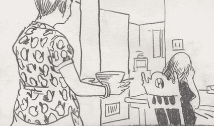
Sex Fantasy #4 opens with an unnamed female sitting on a couch, wearing a black sweater and reading a book. Quickly though a pair of arms shoot through the left panel border and another female, this one wearing glasses, begins to rest her head on the woman on the couches right shoulder and lock her hands together around the woman's neck in a loose hug of sorts. The intimacy of this gesture seems to implicate a closeness between the two figures, and as the previous three issues have conditioned you to expect, you await the figure in glasses to begin whispering her odd sex fantasies into the sitting womans ear.

The fantasies you expect to see here though never come, although the intimacy of the statements are nonetheless present, as the figure in glasses begins to reveal the deeply held thoughts and anxieties of the woman on the couch. These thoughts though are couched (ha ha) by the phrasing “have you ever…” at the beginning of each statement, creating the illusion of a question being asked, when in reality none is.


As each word piles up the woman on the couch begins to sob uncontrollably. This reaction doesn’t seem to affect the woman in glasses though, as her body language and facial expression never changes over the course of the comic. That is except for the ever so slightest raising and lowering of her eyebrows. These movements are meant more to telegraph how each new bit of information will hit her target though, rather then show characterization. So as her eyebrows move upwards you see her words begin leading towards something, until they snap back down into a focused and flat lined stare as she delivers the crushing conclusion to the newest perverse iteration of “have you ever…”.


It isn’t until the comics final page, when a new and grotesque looking figure enters through the right side of the panel that the woman in glasses leaves. Mirroring the woman in glasses movements, only this time in reverse, this new figure rests her head on the sitting womans left shoulder and begins to comfort her instead of emotionally abusing her. Gently placing her left hand on the sitting womens shoulder and, after a brief hug, telling her to “go to bed.” in the narratives only thought to end in a period.

The angel/devil paradigm this story is evoking is interesting, first in the flipping of the imagery of each player (the devil character being depicted as a well dressed 20-something female and the angel being represented by a ghoulish looking woman), but also by subverting the roles each play. While the devil in this classic scenario tends to whisper evil ideas into the main characters ear and push them to do something outwardly bad, here she whispers ideas that sink the character deeper into herself; and while the angel typically counteracts these ideas by explaining the harm they would cause to others, here all she can do is bring her back to her normal state of mind. This leaves the experience feeling not so much as a resolution to the devils words, but rather a momentary respite. 

Sadly that tends to be how mental turmoil works though.
------------------------


Why We Fear The Ocean by Julia Gfrorer and Sean T. Collins

Utilizing both fictional, historical, and real life examples Why We Fear The Ocean looks at the symbology of water to try and unravel what is at the core of mankinds fears of what lurks beneath it. With a deadened narrative voice and a fluid take on panel to panel transitions, recalling more a slide show than a proper comic, Gfrorer and Collins create a sense of dread with each new word and panel read. Because like most fears, this one has more to do with ourselves than the object of fear itself.
------------------------


Actual Trouble by Michael DeForge

In a combination of text and image that recalls storybooks more than comics, DeForge tells the story of a man and his partner who’s erection can not go away. The metaphor is ethereal, meaning many things at once, but it always comes back to frustration, with work, with what you missed out on in life, and of course with sex.
------------------------


The title, Semi-Vivi, is a bit of wordplay, combining the titular characters name Vivi (a nickname) and Vivo meaning half alive. Half alive though could just as easily mean half dead, and for the majority of this narrative it seems like a more apt description of Vivi.  

As an entry in the Frank Santoro run Comics Workbook Competition Semi-Vivi takes place in a static 8 panel grid, each 3.25 x 5 inches in size and landscape oriented. Unlike other contestants who simply work within this grid, GG fully embraces it, making the grid into an integral part of Semi-Vivi’s narrative. As we watch Vivi’s life being controlled by boxes, the boxes of the grid become just another obstacle for her to overcome.


Semi-Vivi opens on Vivi watching a youtube video about creating hand drill fires, a skill that with the advent of lighters has largely been regulated to survivalist instructors who break it out on television shows as a way to impart their bonafides to viewers as they stumble through forests hundreds of miles from civilization. Vivi’s viewing of this video is cut short though, as rays of light suddenly beam across her face after the door to her apartment(/older brothers garage) is opened slightly. Confused Vivi walks to the door where she finds a note from her older brother telling her that the lawyers who took over the home want her to vacate the garage apartment “ASAP”. This brief intrusion of the outside world into hers will become a recurring theme in this comic, as each moment of solitariness is interrupted by the outside.

After reading her brothers note, Vivi begins walking alone towards a local park. Before reaching the park though her phone goes off alerting her to a “totally cool 80’s themed party” that she has been invited to over facebook that night. After hitting decline we see the first hint of Vivi’s frustration as she adds a “LLP” to a still wet patch of concrete, which had previously been graffitied with the words “HELL”.

This cry for help though is not answered, as she moves around town her life is continually interrupted by outside entities, be it a small child asking to use the swing she is currently occupying, the leering eyes of a fellow dinner patreon as she is eating a slice of pie, or a friend spotting her from across the street and attempting to gain her attention.


Vivi eventually leave of the city altogether, throwing her cellphone into a lake and taking a bus to its last stop which borders the woods. After exiting the bus Vivi lays down on a nearby patch of grass and looks, for the first time, at ease. In this alone state she drifts off to sleep and the comic shifts to a dream sequence. This sequence, like many dream sequences, retells and adds emphasis to certain aspects of the narrative to this point, and gives hints towards a possible conclusion. As Vivi opens a box to find a small baby bearing the face of the man who was staring at her in the dinner, shocked Vivi throws the baby in the air to find herself trapped inside of a cubicle, which she promptly knocks the walls of down. Freed of these boxes Vivi strips naked and jumps on the back of a dove and begins to fly away, only to have her new found freedom snatched mid-air by the hand of the friend she had been avoiding earlier in the the city streets and being brought back down to earth. This act jostles Vivi awake and she begins to return home, on her way she comes across the patch of concrete that she wrote “HELLLP” on, but again the outside world felt the need to encroach on her plea and responded to with (a not shocking) “FUK U” and “NOOO”.


Upon reaching home Vivi finds her belongings boxed up and laying on the ground in front of her apartment. Her brother had the movers box them up while she was away. Following her dream, in which she destroyed the boxes enclosing her life and flew away only to be snatched by her associations and belongings, Vivi attempts to actualize a new ending for herself. Moving from the half-dead individual which existed for the majority of the story and transforming into one who is half alive, Vivi removes a single book from the boxes (Il canto dell' immediato satori) and implements her newly learnt fire starting skills by setting the boxes and her belongings on fire.


Like the eight panel grid, there is one more rule in place for the Comics Workbook competition and that is that the work needs have both a front and back cover. With Vivi’s fire induced catharsis in full effect, and the required grid no longer in play, GG chooses to use the back cover of the book to echo Vivi’s previous dream of flying away on a dove, illustrating a single image of a dove flying into a void of white, free of the boxes that had once held it captive.
------------------------


Waylaid by Andrew White

A graphic novel length narrative released in the dead of night, White’s Waylaid tells the story of a relationship but more so it documents the confusion of life, love, and friendships. White overlaps his panels into such a dizzying array that it is difficult to see when a panel starts and when it ends, where the border resides and where it is just part of the color scheme. But it all goes towards keeping the reader at arms length from the narrative, keeping them from projecting something easy onto it, from looking at those pictures in the basement and placing them into an easy order for themselves.
------------------------


Hollow: Part 1 by Sam Alden

Hollow follows motion like energy, waiting for a spark to appear and then following it until it burns out. Opening on two teenagers talking about the “Hollow”, the economics of summer beach homes, and Lara Croft: Tomb Raider we watch one of them craft an apple pipe, but following a few hits it is knocked over and the contents housed inside fall into the sand.
They decide to go home.

Alden uses the comics equivalent of a single tracking shot here, following them as they walk the length of the beach back to their home, showing each step the characters make, each gesture, creating an animation like feel. During their walk one of them begins telling the story of a dog attacking her younger brother, instead of telling this bit of backstory as a series of talking heads (comics is a show don’t tell medium) or breaking the shot and moving into a flashback, Alden instead visually incorporates the story into the scene itself. As all the chaos one would expect a dog attack would entail, interweaves between the two teenagers footsteps, the shot continues.


Reminiscent of Blaise Larmee’s 2001, Hollow feels like animation. While Larmee stayed away from boxing his figures (explicitly) within a grid in 2001 Alden, needing for his story to work as well in print as on tumblr, fixes Hollow within a two panel grid that is so unobtrusive that you hardly recognize it being there. This grid keeps the eyes moving downwards, in one fixed position, instead of darting side to side and breaking the reading continuity.
------------------------


This ones vague, that is mainly because i could not lock down just one single strip to refrence. Stein shifts between the present day and her childhood with such ease that every strip builds on each other and blends into the story of her life. They’re funny, sometimes sad, but always feel real.

Also Stein has one of the best color palettes in comics.
------------------------


Brain Buzz by Lala Alberts

This is a cheat, since this comic originally appeared in the print anthology WEIRD, but I don’t really mind cheating. Plus the first time i read it was online.

Alberts is at the forefront of the comics trend towards body horror, and while her contemporaries have also used entities growing inside the human body to great effect, Alberts is unique in that she turns these invasions into an aspect of horror; unlike say Mia Schwartz’s Strawberries which, while deeply effecting at conveying the confusion taking place in ones own body, largely plays it off for laughs.

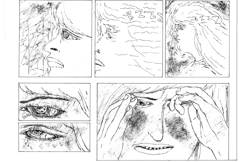
Brain Buzz is like reading a comics version of a Discovery Channel special on strange parasites that live and devour you from the inside out. But while a tapeworm leaves you ignorant of its presence for most of its lifespan, the creatures of Albert’s Brain Buzz (bee’s) exist both within and outside of her protagonist, turning her into a human hive.


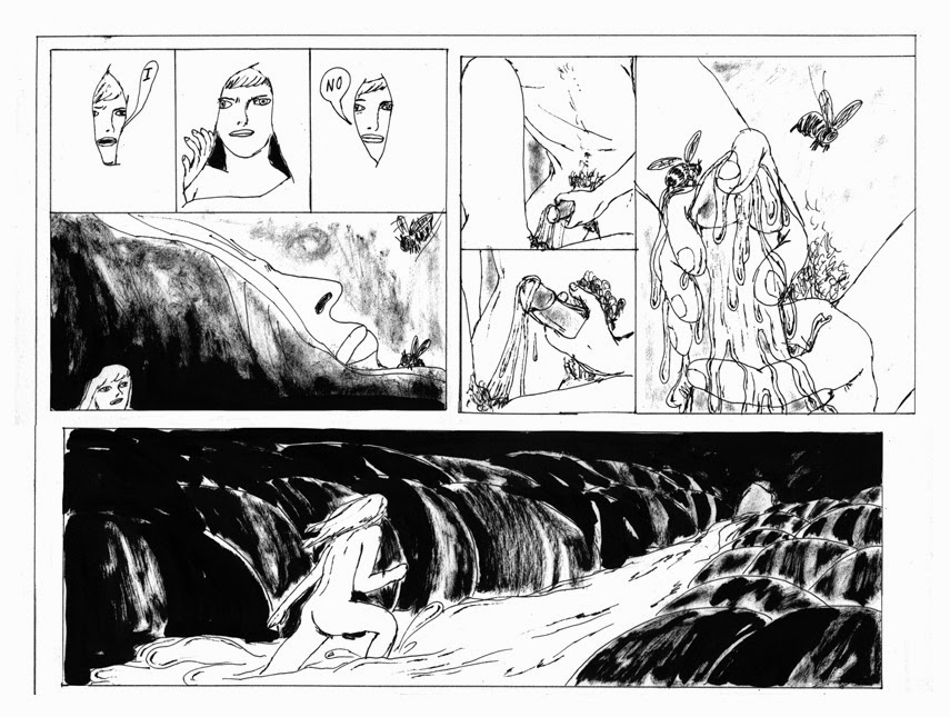
The first hint at this infestation is when the protaganist plucks a bee out of her hair while on her way to work. Holding the bee in her hand she is shocked at its docility, that the bee did not sting her but instead simply flew away. That her immediate thought is shock about not getting stung is not unwarranted. Bee’s sting, thats what life has taught us. And it is this knowledge that Alberts is playing with thematically, because to put it another, more blunt way, bee’s penetrate humans. It’s in their nature. And it is this idea of penetration that is at the heart of Brain Buzz, as following a mysterious (seemingly bee induced) mind shift the main character begins to think of the idea of sexual penetration obsessively, and following an attempt at masturbation that doesn’t work, ends up texting a friend for casual sex.


The moment of penis to vaginal penetration causes another mind shift, this time though it is not her thoughts that change, but her body, as she shrink down into a miniature version of herself and finds her new body inhabiting the head of her old. Rushing for an exit, she is able to open a hole in her neck and escape. As she leaves her body a rush of bees begin exiting alongside her. Having made it to the bedspread she sees that her old body (and that of her hookups) is now encased in a waxy (or honey?) substance. With each further step she begins to grow back to her original size, and that is where the comic leaves you, at a messy fluid filled finally.

While the narrative isn’t particularly clear on its meaning, the feeling Buzz Brain imparts is precise. As each bee’s buzz leaves a cold chill running up the length of your spine that make the strangeness of penetration, both by an insect and a person, all the more felt.

Honorable Mentions (Updated):

Ebbits by Michael Litven
Megg, Mogg, and Owl by Simon Hanselmann
The Short Con by Aleks Sennwald and Pete Toms
On Hiatus by Pete Toms
The Rider Part 1 and Part 2 by Derek Ballard
S. Song by Sarah Ferrick
White Hot by Gloria Rivera
Morgan by Frank Santoro
Goethe Institute - Blaise Larmee
Winter Break by Michael DeForge
Configuration by Aidan Koch

(new "sick" webcomics that i have just been made aware of in the past 24 hours by the all knowing and all seeing mairead )
 
Future Guwop by Max Huffman
Slowly Dying by Disa Wallander
Whatever This Is Called by Ville Kallio
Crow Cillers by Cate Wurst
kc green’s Graveyard Quest
All of Andy Douglas Day’s Strips Like Holy Shit
Dane Martin’s Debbie Comics And All That
Pearlescent Gray by Zach Hazard Vaupen
4koma’s by Momga
The Subject by Rachel Masilamani
Shit and Piss by Tyler Landry
xmas lemmings things!
Patrick Kyle’s Special Friend 
Death of a Crow by Liam Cobb


{Scattershot 8}

$
0
0
Webcomics


Michael DeForge has launched a Patreon. For $3 a month you get 12 to 20 pages of original comics every thirty days, which seems like the best deal in comics.


I started to wonder what Ethan Riley has been up to, and after a quick google search i found that he had a few short comics on his site which i have not read. So heres a link to those.

A compilation of every Same Hat scan.

Subscription Drives

(Preamble: 2014 is almost over which means, as has now become a sacred event over the past two years in alt-comics, every small press publisher will begin opening subscriptions to their 2015 publishing slate. It makes sense to do this at the start of the year, it really does, but the drawback is that 15-20 different publishers are offering the same service at the same time and it begins to get overwhelming, at least for me. So the general idea behind this section is to keep a rolling list going to make things slightly organized.)

Youth In Decline (Ends 2/14/15)

Interviews


Experimental manga (and comics in general) heavyweight Seiichi Hayashi was interviewed at Varoom.I think this is the first interview i’ve ever seen with him. I guess that may be a pitfall with Holmberg dropping definitive histories to every book he translates in the leadup to their publication.

This is a bit old, (as in 6 months old) but Jog interviewed Jean Pierre Dionnet for TJC. Dionnet seems like a world class talker, but since i know so little about him this isn’t a problem.

In this excerpt he talks about finding Jack Kirby:

“And then I found an Iron Man begun by Gene Colon and finished by Jack Kirby. And I found the Thor story where he goes in the Inferno. I was hooked, because suddenly I realized that he [Kirby] was the master of that new form called comics. Not coming from a good copy of comic strips like some others, because of a bunch of EC reprints or whatever. It wasn’t something reminiscent of Alex Raymond. Al Williamson was very friendly. But with Kirby, I discovered a guy who, for me, opened the door and closed it. After, everything is postmodern, including Watchmen, which for me is the tomb of comics, built on the body of Ditko.”


Olivier Schrauwen interviewed at Pastebin. A short interview, but much better than i was expecting.

Bart Beaty talks about his book on Archie. As Beaty mentions early in the interview i’m glad he, and his publisher, moved away from the “greatest” hits aspect that most academic writing on comics tends to fall into. Maus and Fun Home are fine (or Fun Home is fine, i have issues with Maus) but when every book on comics revolve around them it seems a bit...reductive. I get that it’s a “new” field but imagine if every academic book on cinema was about Citizen Kane. It’d be laughable.

Essays/Reviews


Matt Seneca returns from his self inflicted retirement to review the presumptive book of the year Richard McGuire’s Here. 
By way of thaleslira a link to a composite list of some of the articles written for the now defunct Comets Comets. The comment sections also seem to be intact which is really great.

Ryan Holmberg on Baby Boom at Comics Comics. This is really interesting in that Holberg discusses a fatigue with Yokoyama clean worlds and a wanting for him to evolve, which he seems glimmers of in Baby Boom. Based on his work published in the US after this article though it seems like it was just that, a glimmer and a hope.


Gabriel Winslow-Yost writes a pretty great essay on Tardi’s two books dealing with the First World War, It Was and War Of The Trenches and Goddamn! This War!. The hardest part with writing about those books is conveying Tardi’s anger with the forces that sent those young men to die needlessly, and also his sympathy for those sent.

Other

Mr. Oliver Ristau posted his top 20 comics list (top 5 with 15 honorable mentions). It’s in german, but you can give the list itself a glance since each title mentioned is in english. Plus if you’re feeling bold you run the article through google translate and get the gist of each piece.

Killer Mike and EL-P discuss the filmography of Steven Seagal. Blind devotion to action stars / films is something i can deeply relate too. Seriously talk to me about Roadhouse and Nic Cage with me sometime.


Four images of Ken Kagami SnooPee

Benjamin Urkowitz posted his best of list on his tumblr, which google docs doesn’t allow me to hyperlink to so heres that link in full: http://----comix.tumblr.com/post/104539620043/comics-2014-i-am-going-to-alter-what-you-are


Ryan Sands is selling a digital edition of Prison For Bitches, his and Michael DeForges (in their first collaboration) Lady Gaga fanzine for $1.50. I think this is a trial run to figure out price points on future digital editions of Youth In Decline work. That particular fanzine is interesting because its contributors list is pretty much a who’s-who’s of alt-comics today in one single place, five years ago. 


Media Consumed In The Month Of December

$
0
0
Film

All The Boys Are Called Patrick
Brooklyn Nine-Nine Season 1
Hard Boiled
Une Femme Est Une Femme
Regarding Susan Sontag
30 For 30: The U
Banksy Does New York
30 For 30: Rand University
Gerhard Richter Painting
Marina Abramovic: The Artist Is Present
La Chinoise
Time Is Illmatic
The Mindy Project Season 1 & 2
Bojack Horsman Christmas Special
A Brief History Of Time
Archer Season 1 - 4
30 For 30: The Price of Gold
Anchorman 2
The Muppets: A Christmas Carol
The Simpsons Season 4
The Interview


Comics

Yummy Fur #10 - #22  - Chester Brown
Ayako - Osamu Tezuka
Loveryboys - Gilbert Hernandez
Arsene Schrauwen - Olivier Schrauwen
Mathematical Solutions For A Global Crisis - Jesse Jacobs
The Shadow: Midnight In Moscow - Howard Chaykin
Through The Woods - Emily Carroll

Books

A Portrait of the Artist as a Young Man - James Joyce
Civil Disobedience - Henry David Thoreau
Ten Days That Shook The World - John Reed
Howl: and Other Poems - Allen Ginsberg

{Scattershot 9}

$
0
0
Self Promotion


I joined Alec Berry’s wonderful column for Comics Should Be Good The Orange Won’t Peel. It has no set release schedule, but we have an idea of one between us. The main thought behind the column is to talk about works we feel are important and overlooked, with a focus on small press and webcomics. Its format is based around two short reviews and a longer conversation between the two of us on a single book.

It should be noted that neither of us are paid for this column. Even though the site it is being published on is a subsidiary of CBR, which to my knowledge is profitable. This knowledge is based around it still existing, along with every annoying ad i get while visiting it. I knew this fact well before agreeing to write for it, and since i never signed any deal I will most likely be posting my individual essays (minus some edits) a few weeks after their appearance on that site here.

As an occasional writer on comics i feel it is important to discuss content and the sites that post them regarding compensation. To my knowledge The Beat, Bleeding Cool and this particular branch of CBR do not pay any of their contributors. And while Comics Alliance does, they choose to retain the copyright to every author they publish works, something from my basic understanding of writing on the web is unique.

Jonah Weiland, Heidi McDonald and Rich Johnston should be ashamed of this fact. But i’ve heard them wrap riddles around themselves defending this behavior enough times that they won’t be. No one who makes a salary off of others ever is.

I should be ashamed too, to allow myself to be taken advantage like this. To be a cog. But at least for now the thought of writing with Alec outweighs the concerns with writing for a site like this. It may change in the future though. It will most likely change. God i hope it does. Because i don't think the me of a year ago and the me of next year would sit at the same table as me of now if it doesn't.

Anyways if you want to read Alec and I on various comics you can read the column when it comes out. And if you don’t feel like visiting a non-paying yet profitable website for my writing you can wait a few weeks and see it on this blog. I am okay with either choice. I understand either choice. (My union steward grandfather would definitely be saddened by one of those choices though, along with my own)

Webcomics

X-Mas passed since the last one of these posts so here is a Patrick Kyle& Leslie Stein X-Mas comic to remind you about the joys of a month ago.

Katie Skelly returns to the Slutist with a new installment of her series Agent 9. This one has a three panel sequence that feels very influenced by Crepax that i enjoyed. I also liked the flippancy of the dialogue.


A new Connor Willumsen webcomic. It seems particularly Ben Jones-ey. I remember half staring at this book at CAB having no idea who did it and why it seemed to be housed in a manilla envelope. Turns out i probably should have looked a bit harder at it.


Lala Alberts released her previously published by Sacred Prism book Paranoid Apartment online. You can read part one here and part two here.

Interviews


Adrian Tomine announced a new book, Killing and Dying, which is a collection of the past few issues of Optic Nerve. The announcement was accompanied by a New Yorker interview.

On his use of words and images in his comics and illustration work:

“...Most of my comics are pretty evenly divided between words and pictures, and, if anything, I’ve put an emphasis on the writing over the years, letting the words do the heavy-lifting with the storytelling. So, to spend several weeks working on a single image for a cover—and thinking about how to communicate only visually—has been very instructive to me as a cartoonist.”


Essays


Annie Ishii interviewed about Massive, both the new fantagraphics anthology series and the company  of the same name. Massive also created the perfect youtube video to accompany their new book.

Tucker Stone on Demon #10.

Brian Chippendale’s year end review. It’s meandering and at times angry and pretty perfect.


Ivan Brunetti talks about his failed attempt at drawing Nancy. I don't actually mind the strips Brunetti shows, although they are decidedly more nihilistic than Bushmiller's.

Chris Ware on Richard McGuire's Here. I was shocked to find out he’d like it.


Matt Seneca’s best of 14 list. It involves multiple forms of media including best running back, although his best running back choice was pretty predictable.

Media Consumed In The Month Of January

$
0
0

Film

Obscene
Foxcatcher
Whiplash
The Skeleton Twins
30 For 30: The U Part:2
Birdman
The Judge
Selma
Altman 
The Simpsons Season 5
Band of Outsiders
Sweet Smell of Success
John Wick
Women Aren’t Funny
Inherent Vice
The Equalizer
Bobs Burgers Season 3


Comics

Harold - Antoine Cosse
How To Be Happy - Eleanor Davis
An Age of License - Lucy Knisley
Set To Sea - Drew Weing
Fran - Jim Woodring
Before Bone - Jeff Smith
The Late Child and Other Animals - Marguerite Van Cook & James Romberger
Usagi Yojimbo v3 #39 - #85
Rage of Poseidon - Anders Nilsen
Beautiful Darkness - Fabien Vehlmann & Kerascoet


Books

On Photography - Susan Sontag

{Scattershot 10}

$
0
0
Webcomics 


The Darling Sleeper, The Mediums alt-comics blog, has posted several worthwhile webcomics. The most important of these though, at least for me, marks the return of Michiel Budel the artist behind Wayward Girls with The Hoax. Michiel is one of the most interesting and singular artists in alt-comics and his absence over the last year or so has been very sad. I’m glad he is back.

Swim Thru pt 1. by Annie Mok & Sophia Foster-Dimino is a really interesting and beautiful take on the long scroll comic. The use of characters moving horizontally as a natural stopping point in the scroll is fascinating. I’m not sure how intentional it was, but i enjoy how it worked and i'd like to see that idea developed further. The stories about mermaids, but like most stories about mermaids it isn’t.


Subscriptions / Patrons / Other


Youth In Decline’s yearly subscription is almost over. That seems like the one must have subscription. At least for me. Sands is one of the few publishers who is able to find talents that i am completely unaware of and present them in a beautiful format every three months. 

In other almost done yearly subscription news Uncivilized Books spring season has a subscription that is in its last few days. Two of my favorite books of 14’ were released by Uncivilized so i see no reason why this year would be any different.


It’s a new year, which means one thing and one thing only: A new series of COPRA is starting up. COPRA 19 can be purchased here.

Interviews


Alex Degen , Leslie Stein and Sam Alden are interviewed at The Darling Sleeper. The most interesting aspect of those interviews is seeing the artists workspace. I don’t think the questions are particularly strong, and their repetition of a few of them across every interview makes for bland reading in some parts because of the nature of the questions.

Essays

Julia Gfrorer on Dead Astronaut Comics by Jack Teagle and Starlight Local by Lala Alberts. Gfrorer has written about the same Alberts comics as me over the last few months and every time her column comes out i feel embarrassed about how bad my essay is in comparison. 


-----------
(sorry for being short on essays and interviews this month. For some reason i didn't bookmark that many and now i can't think of any...so...yeah)

Lights On

$
0
0

Comics are a synthesis of words and images. This synthesis though has always been a lopsided endeavor. At least intellectually. As a visual medium comic must place an emphasis on the image over the words. A natural outgrowth of this is that the words placed within a comics panel should not repeat the information given in the panel, but instead relay information independent of the artwork. To borrow a phrase from film (another medium of synthesis, this time of image and sound) comics is a show don’t tell medium.

Sarah Ferrick’s approach to comics is unique, not in that she subverts this idea, what is said and what is depicted are wholly different, but that the words themselves are turned into the primary art object being depicted. The images inside the panels are merely window dressing for the words. By turning the words themselves into an extension of the artwork each letter she chooses, and how she chooses to draw them, becomes a crucial plot point to the story being told.

There are seven words total in this comic. Almost all repeated at least one. Some right after themselves. Ferrick choose each word carefully, both for their meaning, but also for how strong and weak each word is, in the abstract and in relation to each other.


“GOD” echo’s throughout this comic, taking up almost the entire left half of the page first. Each letter of “GOD” is depicted with a tightness, although the rounder elements of O and D are given a bit of dimensionality around their corners, the actual pencil lines that make up each letter are carefully constructed to make the image of the word “GOD” appear orderly. The red coloring, which is used to highlight each letter, is also tightly packed within the linework of each letter. All this attention gives a great importance to the word “GOD” within the image, but the sound that is produced in the readers mind is not a yell or a scream, but rather a passive use of the word. Evoking the meaning behind the word, but not the brimstone.

To the immediate right of “GOD” is a series of black boxes drawn within each other. On the top left corner of each box Ferrick paints a small band of yellow and white to give them the sheen of light and an added depth of space; creating the visual effect of a hallway of sorts. At the end of this series of boxes we see the words “FUCK ME/FUCK ME” etched into the final black box in the same shade of yellow as the highlights. Due to the words perceived distance from the reader, and the cleanness of the lines that make them up, they seem almost quite, like faint whispers.

Ferricks use of “FUCK ME” and “GOD” on the first page is interesting, because everything involved in their depiction has a silencing effect. For such strong words they don’t feel that way. The control of the letters, along with the deafening nature of her blacks, make the words barely register so that even the vulgarity of the fuck and the holiness of god are muted; creating at most a rise in the reader but not a feeling.


The next page is a response to the words spoken in the first, but the calmness of the first page is now a contrived hesitence. Beginning with a big fat “BUT” which seems to be in the process of overlapping within itself, turning each bend of the B into another corner to hide in. Unlike “GOD” “BUT” is given no primary coloring, leaving it to exist in its own translucence, making each of its twists and turns all the less effective. Every line can be seen by the reader because it has nothing to hide behind. Below it “BUT” is repeated once again, but in its stark black it resembles more a shadow of its first appearance than a new iteration.

To the immediate right of “BUT” we see Ferrick's use of commas to create a sense of stuttering for the reader. Again one of the “I,” is drawn with a deep black while the other is in a looser and plumper style, creating the resemblance of an echo between each other. Additionally we see the use of a comma here which, unlike a period that would have caused a stop in the readers mind, causes the reader to stammer over themselves as they read each letter in succession.

Taking up the entire right half of the second page is a giant “UH” drawn in almost complete black, sans the mild application of purple to create a bit of dimensionality. The “UH” resembles the “GOD” found on page one in its size, but the strength represented by “GOD” is devoid here. By depicting “UH” in a similar manner we see explicitly how quivering the response to the first page is, the “UH” reinforces the “BUTS[’s]” and “I[’s]” on the left side of the page, but unlike “GOD” which gives strength to the “FUCK ME/FUCK ME” this “UH” reinforces how weak they are, turning the whispers they represent into pure silence as “UH” drones on.


On the final page “GOD” is repeated once again. Ferrick’s representation though is less controlled, reminiscent now more of the anger found in the words of god in the old testament rather than the new. Each letter is drawn looser, with an added depth in linework so that it looks like each letter is falling backwards into itself. Where the red coloring in page one was exact, here it looks as if it was almost glopped on and smeared around the linework in circular motions only to be violently dashed off when Ferrick came to a straight line. It’s utterance now has an anger to it.

The small corridor that once housed a tight and quickly repeated “FUCK ME/FUCK ME” has also now been blown up in size and is depicted in a less controlled manner. The highlights of yellow are now erratic splotches of no color. Due to the lengthening of the hallway the echo effect of GOD feels infinitely deeper now; as it reverberates down the long hallway of nothingness it seems like it never ends. The whisper of “FUCK ME/FUCK ME” seems long gone.

In the bottom left corner of the page, almost hiding from this noise and anger is a small penciled in box with the words“But. I, I, UH” inside. It continues to feel like the wrong answer.

------------------
You can find Sarah Ferrick’s Tumblr Here. 
------------------
*This post originally appeared on Comics Should Be Good
Viewing all 81 articles
Browse latest View live


Latest Images